Visual Hierarchy
Crumbl Cookie
crumblcookie.com
Crumbl Cookie's website is a prime example of visual hierarchy. The get the user's attention with a big image of one of their delicous cookies, or at least is looks delicious. They make the user desiring to try one of their cookies. You next see their logo on top of the screen and the "order" button below.
Alignment
Dainty Jewells
daintyjewells.com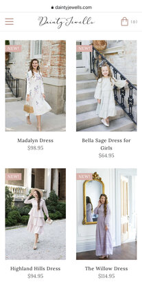
This image shows an example of Dainty Jewells using horizontal alignment. It makes the images align therefore making easier for the user to shop for their clothes online.
White Space
National Park Service
nps.gov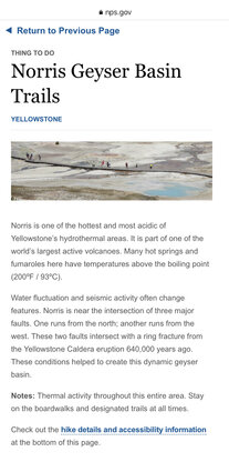
This image shows use of white space. There is suffiencent white space between the heading, the image, the paragraphs and around the border making it easy for the user to read about Noris Geyser at Yellowstone National Park.